All chart controls are now grouped into a single, structured settings panel, giving you greater control over how your data is visualized.
This update includes:
-
A clearly structured settings panel organized by chart components
-
50+ new advanced settings across supported chart types
-
Pixel-level control over formatting, styling, and layout
-
Smart inheritance so common settings apply automatically
-
Basic and Advanced modes to suit different user needs
The result is faster configuration, improved consistency, and more professional visual outputs.
What Problems Does This Solve?
Previously, chart customization could be:
-
Difficult to navigate
-
Spread across multiple menus
-
Repetitive when applying formatting
-
Limited in advanced styling control
This update:
-
Makes chart settings easier to locate
-
Reduces repetitive formatting through inheritance
-
Supports both quick edits and advanced customization
-
Helps create consistent, presentation-ready charts with less effort
Key Improvements
1. Simplified Navigation
All settings are now accessible from a single, organized panel.
Previously:
-
Axis settings were accessed individually per axis.
-
Some formatting options required navigating through multiple menus or using the settings (cog) icon.
Now:
-
All axes can be configured from one consolidated panel.
-
Settings are grouped logically by chart component.
-
Fewer clicks are required to make changes.
How to Access Chart Settings
-
Open a chart within a report.
-
Select the chart to activate editing mode.
3. Use the settings panel on the right-hand side.
If the new settings panel is not visible, please contact team@askbosco.io
Formatting Inheritance
Common formatting settings are now inherited across similar chart elements.
For example:
-
Applying number formatting to one column automatically applies it to comparable columns.
-
Shared formatting improves visual consistency across reports.
Individual formatting can still be overridden where necessary.
This reduces repetitive setup and helps standardize reporting outputs.
Basic Mode vs Advanced Mode
Chart Settings load in Basic Mode by default, displaying commonly used options.
For additional customization, you can enable Advanced Mode within supported panels.
Advanced Mode provides:
-
Expanded styling controls
-
Aggregation adjustments
-
Additional display and formatting options
When enabled:
-
The preference is saved
-
Advanced Mode applies across all panels that support it
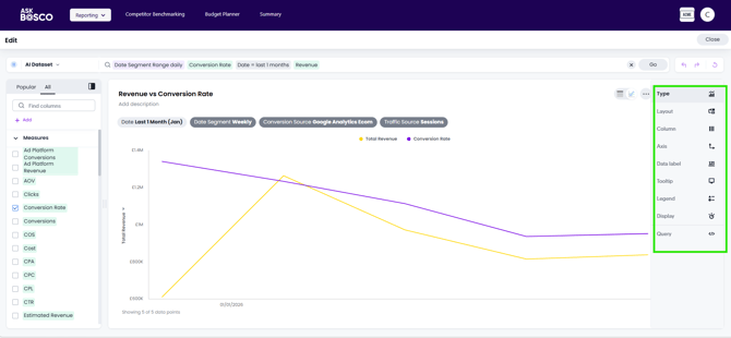
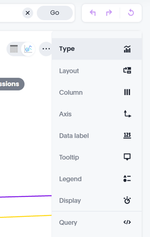
Settings Panels Overview
The available panels depend on the selected chart type.
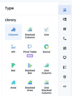
Type
Use the Type setting to choose how your data is displayed (for example, bar chart, line chart, or pie chart).
Changing the chart type may also change which other settings are available. For example, some chart types have additional layout or axis options, while others do not.
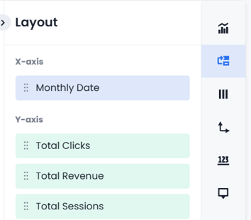
Layout
Define how data is structured within the visualization.
Options may include:
-
X-axis
-
Y-axis
-
Slice
-
Size
-
Size with color
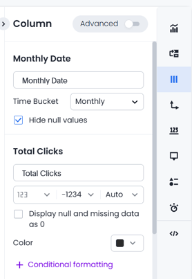
Column
Manage column-level formatting and configuration:
-
Rename columns
-
Adjust sorting
-
Apply number, percentage, or currency formatting
-
Configure conditional formatting
-
Adjust aggregation (Advanced Mode)
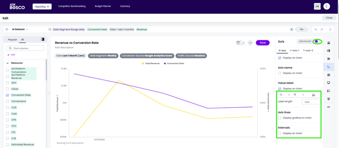
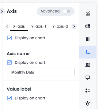
Axis
Control axis presentation and styling:
-
Rename axes
-
Adjust number formatting
-
Change axis positioning
Advanced Mode allows you to:
-
Modify font style, size, and color
-
Adjust numeric ranges
-
Show or hide axis lines and intervals
-
Link styling across multiple axes
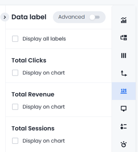
Data Label
Control how labels are displayed within the chart:
-
Enable or disable labels
-
Format label content
-
Filter label display
-
Adjust styling
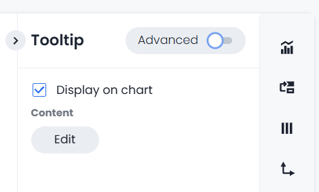
Tooltip
Configure tooltip behavior:
-
Enable or disable tooltips
-
Select displayed fields
Advanced Mode allows customization of:
-
Background color
-
Opacity
-
Border styling
-
Text format and color
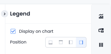
Legend
Manage legend visibility and positioning.
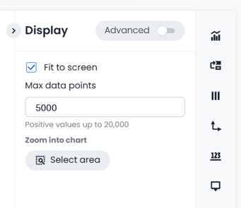
Display
Control chart behavior and scaling:
-
Fit-to-screen options
-
Automatic bar width adjustments
-
Maximum data point limits
-
Zoom functionality
Advanced Mode also enables:
-
Chart background styling
-
Plot area background adjustments
-
Border styling
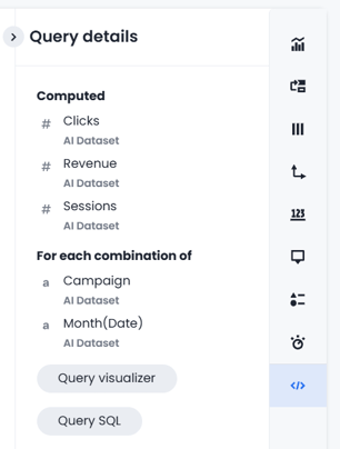
Query
Provides transparency into how the chart is generated.
You can:
-
Review the query structure
-
See which fields and tables are used
-
Access the underlying SQL query
This improves trust and transparency in reported data.
Who Benefits From This Feature?
Executives
-
Cleaner, more consistent charts
-
Presentation-ready visuals
Analysts & Power Users
-
Deep control without workarounds
-
Greater transparency into chart logic
Marketers & Business Users
-
Easy visual adjustments without technical expertise
-
Faster creation of professional reports
Summary
The new Chart Settings experience delivers a more intuitive, efficient, and flexible way to configure visualizations in ASK BOSCO®.
With structured navigation, smart inheritance, and optional Advanced Mode controls, it supports both quick adjustments and highly customized reporting — while improving consistency and reducing repetitive setup.
This article was created by Grace. If you have any questions or need a hand, feel free to reach out to us at team@askbosco.io

Febuary 2026