What Has Changed?
Users can now:
- Configure how KPI values are displayed
- Adjust how missing or null values appear
- Apply more advanced formatting options to KPI visualizations
- Set different colours for anomalies, indicating whether they are above or below the expected value.
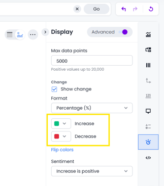
This allows KPI charts to better reflect reporting requirements and improve readability across dashboards.
Where This Applies
This functionality affects:
- KPI visualizations
- Pinned Visualizations
- Dashboards
- Report customization settings
How to Access KPI Settings
- Open a report or dashboard containing a KPI visualization
- Enter edit mode from either the three dots in the top right of the dashboard

- then edit the KPI from the pencil symbol
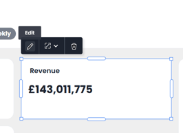
- Or just from the Edit option on any KPI ChartSelect the KPI chart

- Open the chart settings/configuration menu

- Adjust the available KPI display options as required so that the numbers and comparison display as you want them to
Best Practices
We recommend:
- Keeping KPI cards simple and easy to read
- Using consistent formatting across dashboards
- Reviewing null value behaviour before sharing reports externally
Example Use Cases
Examples include:
- Displaying “0” instead of blank values
- Highlighting KPI anomalies more clearly
- Improving dashboard readability for stakeholders
- Standardizing KPI appearance across reports
This article was created by Grace. If you have any questions or need a hand, feel free to reach out to us at team@askbosco.io

May 2026